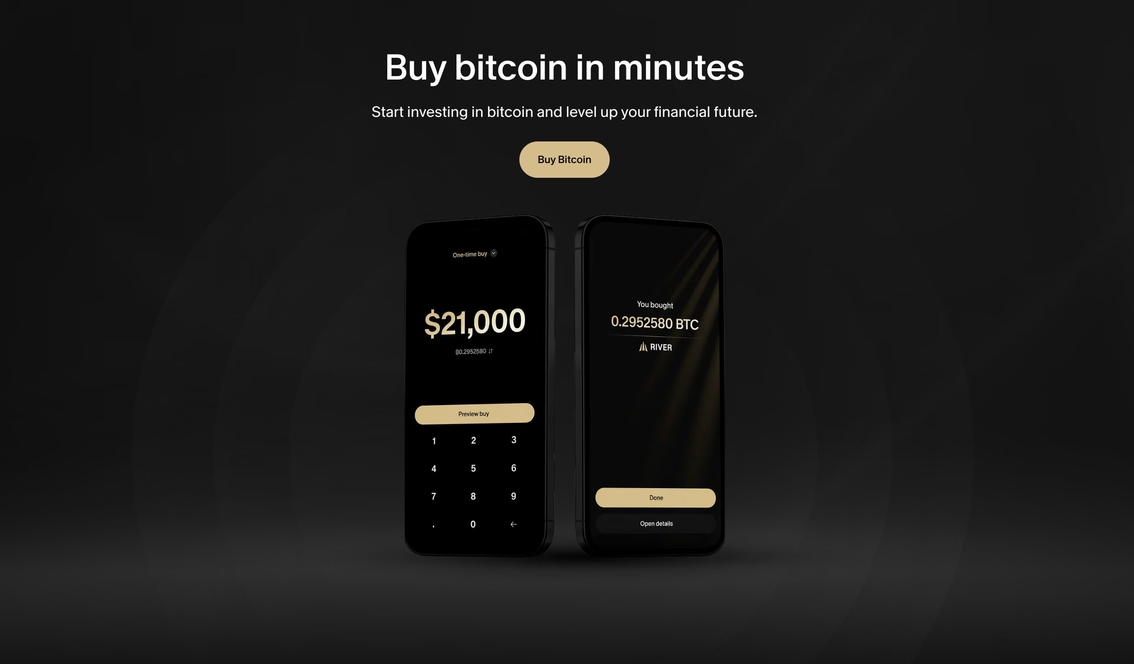
Vincent began his career in Australia as a chemistry lab assistant in the mining industry. After pivoting to UX design in the US, he brings a research driven approach to creating accessible experiences.
He has since worked with @Instrument, @NASA Goddard Space Flight Center, @Peloton Interactive, and @River Financial.
With a background in UX design and my own interest in the financial sector, I enjoy turning complex information into experiences that feel trustworthy and delightful.
Before joining River's product team, I worked as a web designer, UX strategist and chemistry lab assistant. I've had the pleasure of working with clients across a range of fields in the past.


The previous sign up flow squeezed every question into just three steps. On paper it looked short, but each step carried four or five inputs at once, which made the experience hard to digest. Instead of feeling digestible, it felt heavy, information overload right at the moment clients were deciding whether to trust us, and that showed up as a high drop-off rate before they created their account.
The copy didn’t help either. It read robotic and transactional, which put distance between River and the client. For a product where the whole goal is to feel trustworthy, the onboarding ended up feeling cold and bitter.
On the design side, I broke the flow into a more natural, conversational experience: asking for the information at the right moment instead of all at once. The journey moved through three phases: creating the account, verifying the login information, and collecting PII. Each step asked for less, so progress felt steady instead of overwhelming.
I also rebuilt the input experience; inputs now validate well as clients type, addresses are found through search instead of manual entry, and area code and state are handled with dropdowns rather than free text. Small changes, but together they made each step feel faster to clear. The whole interaction should feel snappy, easy to keep moving, so crossing the finish line of onboarding never feels like work.


The first was technical. The sign up flow needed a full overhaul: the engineering team put in serious effort to retire the old LiveView stack and rebuild everything in React. That rebuild let us equip the flow with a state machine, so clients can move back to a previous step whenever they need to. At the same time, we were in the middle of a brand redesign, which meant every screen I designed had to keep pace with evolving fonts, styles, and components, and stay consistent as the brand itself was still changing underneath us.
The second was the sheer number of edge cases. Onboarding is full of them: what happens when a client’s identity can’t be verified, when they hit an age limit, an SMS limit, or a password rule, when an address doesn’t meet requirements. Each path had to be investigated and designed for, so the experience stayed clear and trustworthy no matter where a client landed.


We’ve just shipped the mobile web experience, and the native experience is on the way. Working alongside brand and marketing, I’ve been shaping the details that make native feel more delightful and snappy: the logged out experience, animations, custom illustrations for identity verification, a notification upsell, and a Face ID upsell etc.
We’re also exploring moving identity verification earlier in the journey. If a client completes IDV up front, they could skip the PII steps entirely and shortcut straight to the home page turning verification from a hurdle into a fast lane.


The concept simulated a HUD/FUI system adapting to different situations while a Mars Rover is inbound to Mars. It starts from the pilot’s perspective, enhanced with visual elements in various stages of each interface design.
Each design serves a specific purpose to surface situational information and data to help the pilot perform through a unified visual language.


Just Work Out is a popular Peloton App feature that allows users to conduct workouts and track their metrics on their device. However, without an internet connection, clients either can’t start a workout or risk losing their in-progress workout data.
Supporting the Just Work Out offline feature has been a strong ask from clients.

Ensuring a consistent experience across different edge cases required investigation into potential checkpoints that could affect the flow. I worked closely with engineers to define the efficient way to cover all scenarios with the solution.
The solution is allowing device to cache data once a client initiates a workout. Once ending the workout, the device determines whether to continue caching or upload the workout details and sync them to the client’s account.

I think the design challenge here wasn’t aesthetic, it was about mapping every edge case to ensure the experience stayed clear and consistent regardless of connection state.
The goal was to communicate workout status accurately while staying within the existing design system, keeping the solution lightweight enough to ship quickly.


It’s a NASA satellite that shoots 10,000 laser pulses per second at Earth’s surface to precisely measure elevation, mainly tracking how ice sheets, glaciers, and sea ice are changing over time.
It’s how scientists monitor ice loss from space to understand the effects of climate change.

A tool that lets users ask NASA’s ICESat-2 satellite data questions and get answers back quickly without having to download massive files or do heavy processing yourself. You tell it what area of the Earth you’re interested in, and it goes and pulls the relevant data from NASA’s archives and sends back just what you need.
The photo on the right shows the tool in its original state, before I proposed improvements through the SCADpro program.

This project aims to lower the barrier for the public to access valuable satellite data, while also designing a technical mode that improves the workflow for research purposes, starting from a deep dive into understanding how scientists currently use the tool.


OK, It’s such a precious opportunity to be solving a real problem with NASA. From first proposing the idea, to speaking with the ICESat-2 team, to visiting Goddard Space Flight Center to present the design and work alongside their engineers to develop the project, everything feels surreal and I’m incredibly excited to be part of this.
Excited to see our design results to be part of NASA ICESat-2 mission documentation!


A full River.com revamp across 20 pages to modernize the brand within the rebrand work, resolve visual inconsistency, improve accessibility and SEO, and build a scalable front end system from the ground up, reducing development time while keeping layout consistency across the website.

The previous River.com had mismatched components and an outdated visual language made the site hard to maintain and harder to make a strong first impression on prospective clients.
The content was identically repetitive across each page, causing information overload and making it difficult to convey the brand and value prop throughout the website.

After aligning with our lead brand designer, we defined a card and section system that could be adopted across each page while delivering the new IA. I also worked closely with the marketing team to refine the content strategy,
One thing worth calling out, I recommended adopting a full-width section on the homepage for flexible campaign rotation, and assisted with the visual asset production alongside the lead brand designer.

We eventually narrowed down to 14 pages to build. I worked with another design technologist to execute the development.
We focused on building out the section components and card system as the foundation, while the utilizing the new rebrand tokens, and have all the pages behind a feature flag.
The foundational piece took us 3 - 4 days to get right, with support from a senior engineer to review the code. Once the system was in place, it enabled the two of us to build pages like Lego, we finishing a page in 2 – 5 hours depending on the number of sections.


